
A business’s logo is one of its most important branding tools. It can communicate much about a company, from its industry to its values. This post will cover the different types of logos and how to use them effectively. We’ll also discuss some tips for creating your own logo. So whether you’re just starting out or looking to update your current logo, read on for inspiration!
Types of logos and which ones to use for your brand
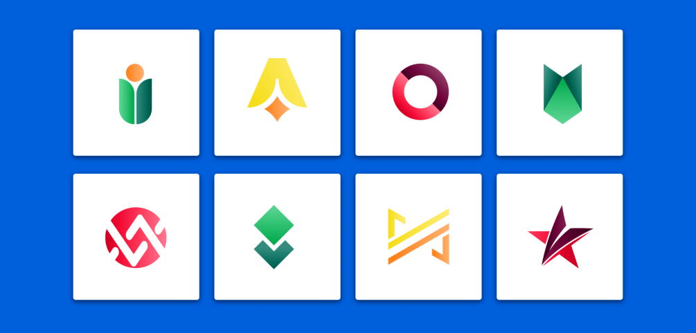
There are four main types of logos: wordmarks, lettermarks, pictorial marks, and abstract logos. Each type has its own benefits and drawbacks that you should consider before choosing one for your brand.
Wordmarks, also known as logotypes, are logos that consist of only text. They can be very effective if you have a strong name that is easy to remember and recognize. However, they can be hard to read if the font is too small or intricate.

Lettermarks are logos that consist of only the initials of your company or brand name. They can be a good choice if you want something that is unique and memorable. However, they can be difficult to read if the letters are too close together or if the font is too small.
Pictorial marks are logos that feature an image or symbol along with the name of your company or brand. They can be very effective in helping people to remember your brand. However, they can be difficult to read if the image is too complicated or if the text is too small.
Abstract logos are logos that do not feature any literal images or symbols. They can be very effective in helping people to remember your brand. However, they can be difficult to read if the text is too small.
Logo usage guidelines: how to use your logo correctly
When using your logo, always use the official version that you can download from our website. This ensures that the colors are correct and that the quality of the image is high.
If you need to resize your logo, do so proportionally. Do not stretch or squish the image, as this will distort it.
When placing your logo on a background, try to use a light color so that the logo is visible. Avoid using dark colors or busy patterns behind your logo, as this can make it difficult to read.
These are just a few general guidelines for using your logo. Please contact our marketing department for more specific information on how to use your logo in different situations. Thank you for helping us keep our brand identity strong!
Recommended To You